Peace Tea Packaging
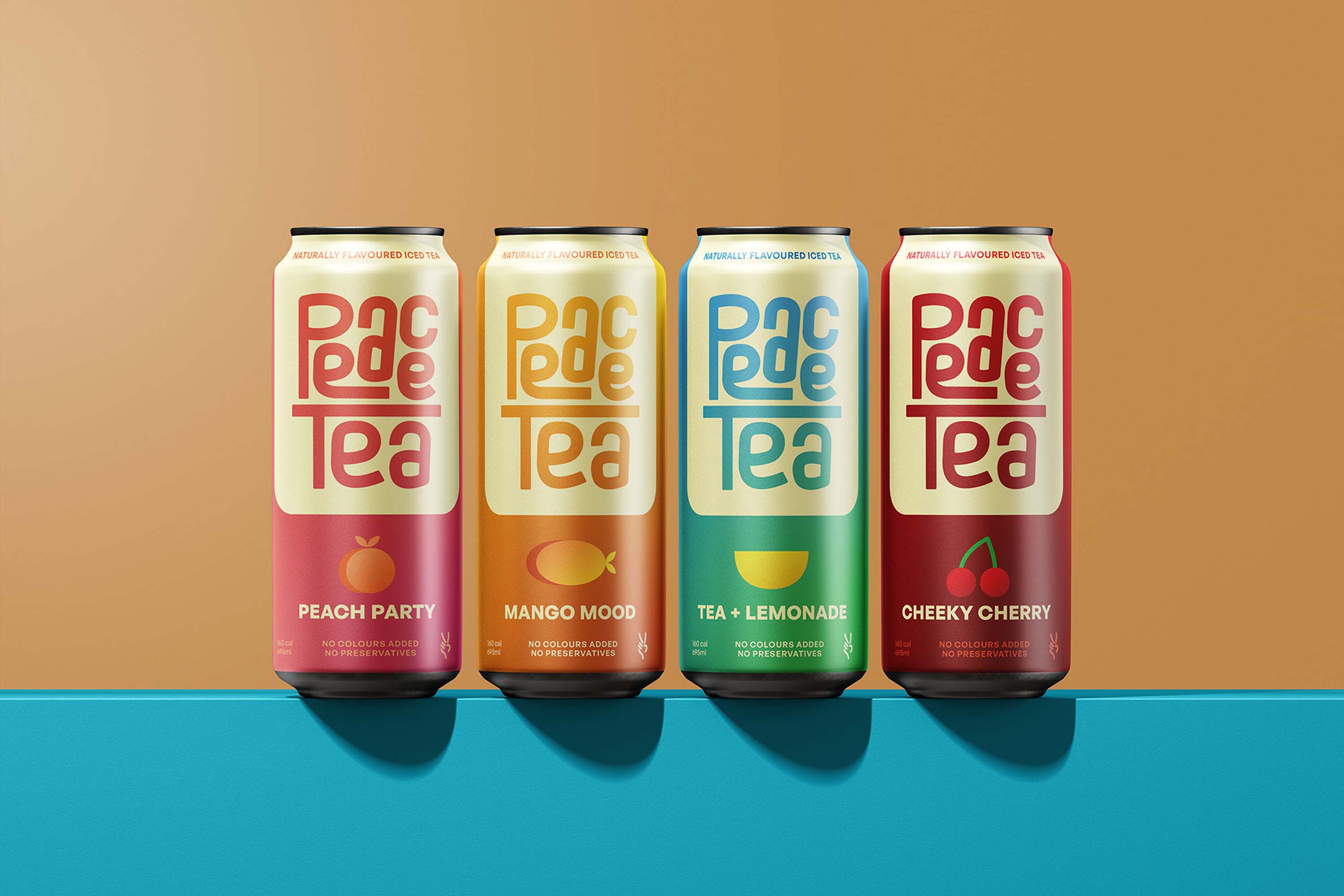
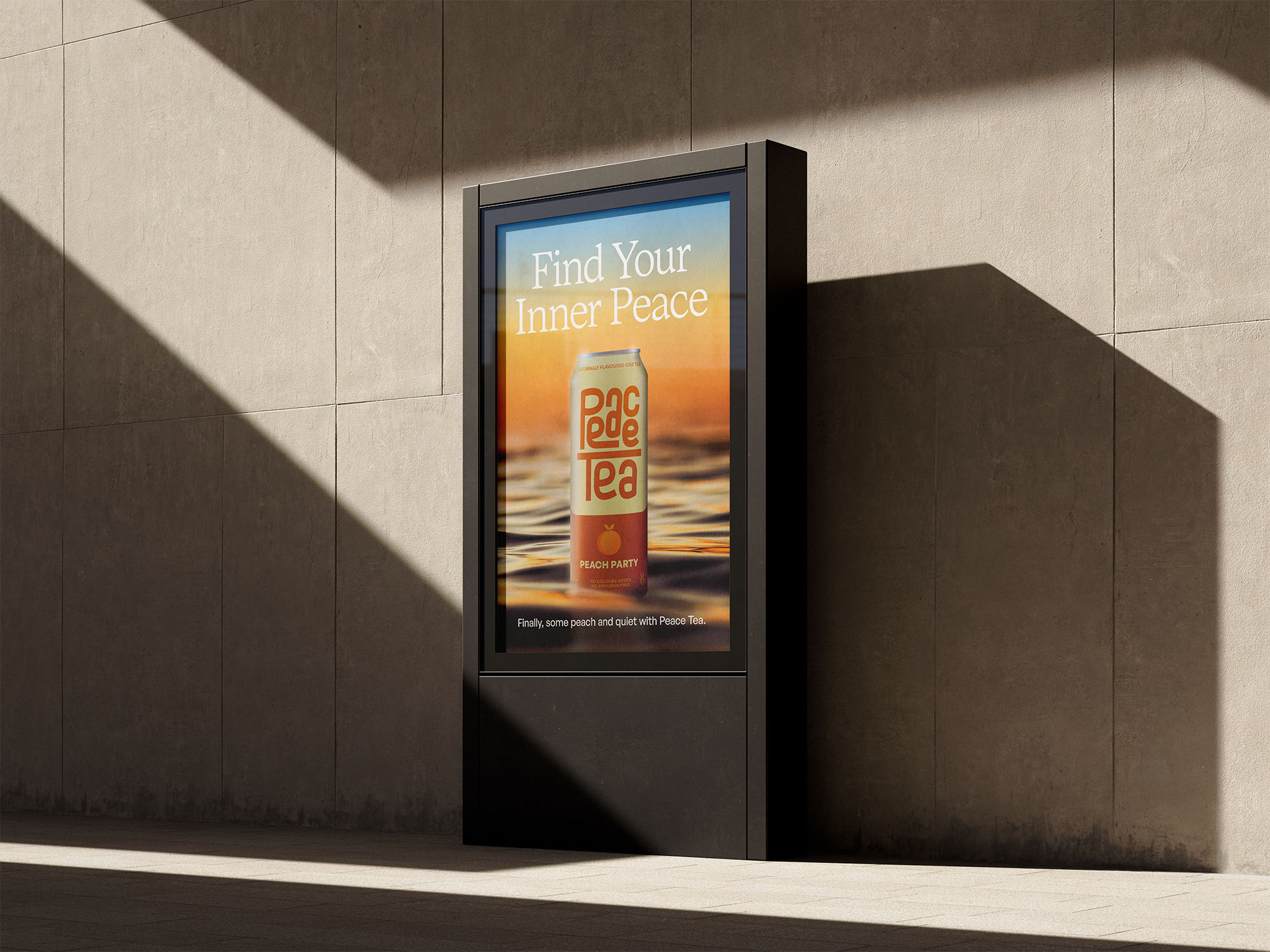
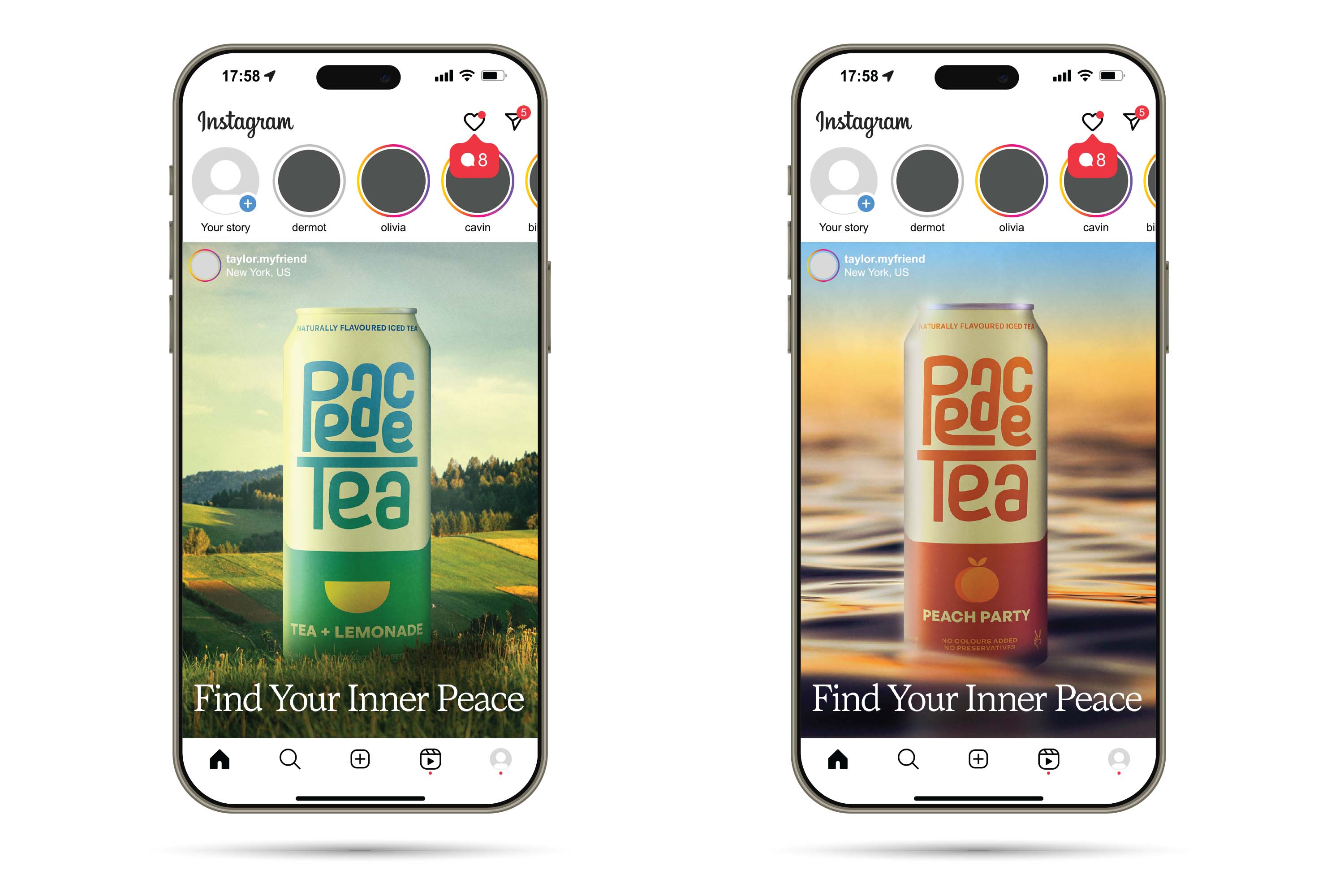
This project included a complete redesign of the Peace Tea drink packaging. After doing research and creating a design brief, it was clear that Peace Tea needed to maintain a fun look. The new design features some custom type, a gradient that changes for each flavour and a simple icon to represent each flavour. The custom type for the Peace Tea logo is unique and stands out while remaining timeless. Creating a new gradient for each flavour adds an effortless aesthetic to each can while saving tons of time on the design process if new flavours are to be introduced. Can you spot the small homage to the old can design? Ads for this package redesign picture the cans in their natural habitat, showing the audience that Peace Tea really is that peaceful.