Helping Hands Rebrand
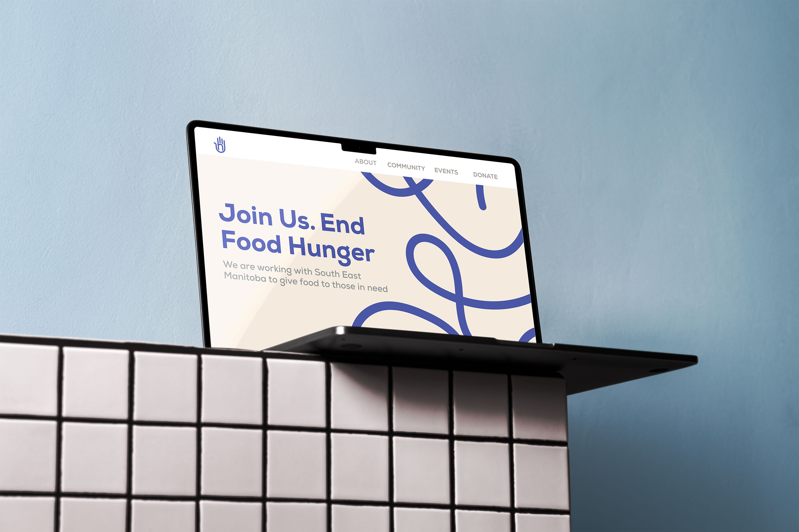
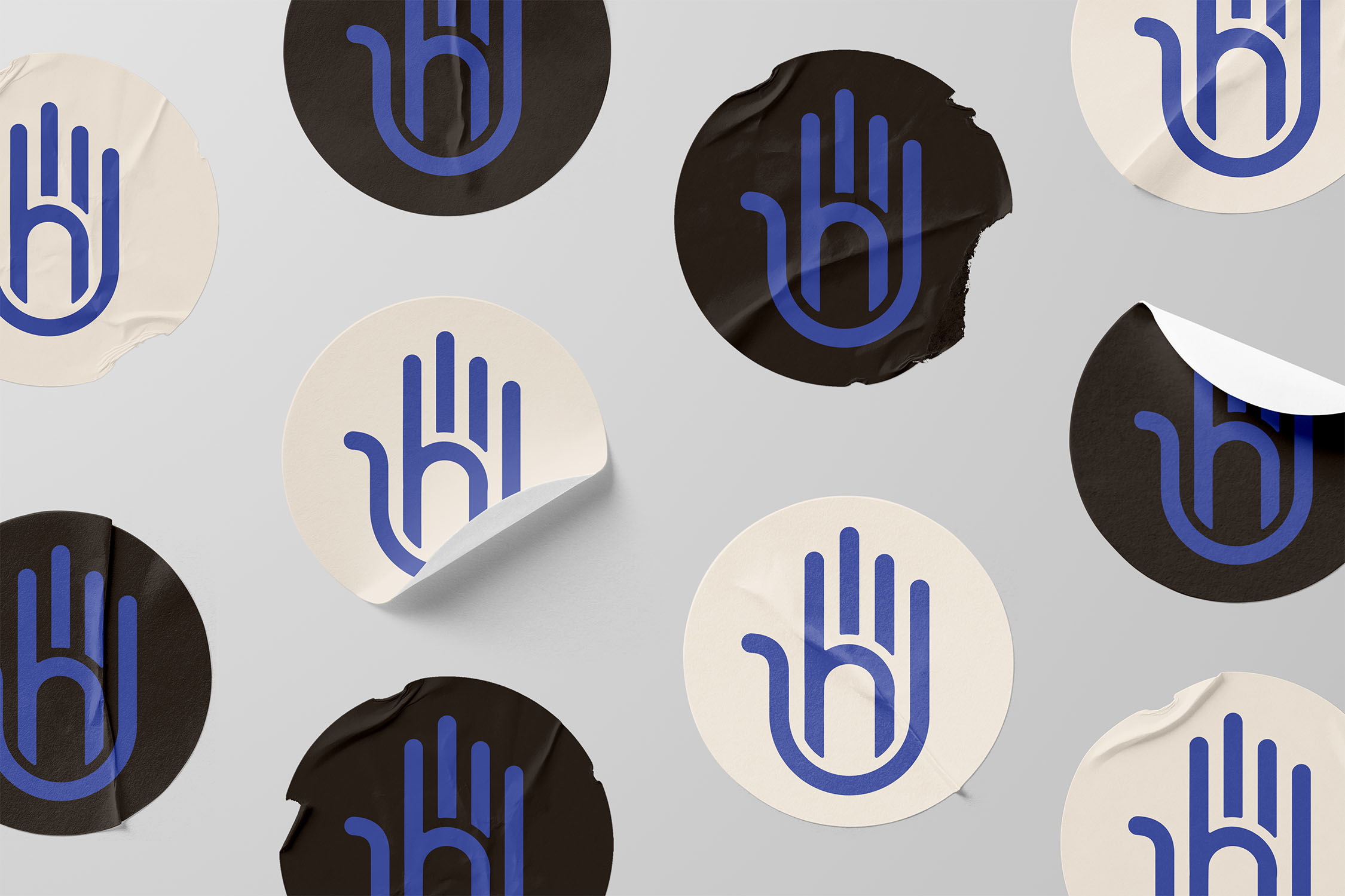
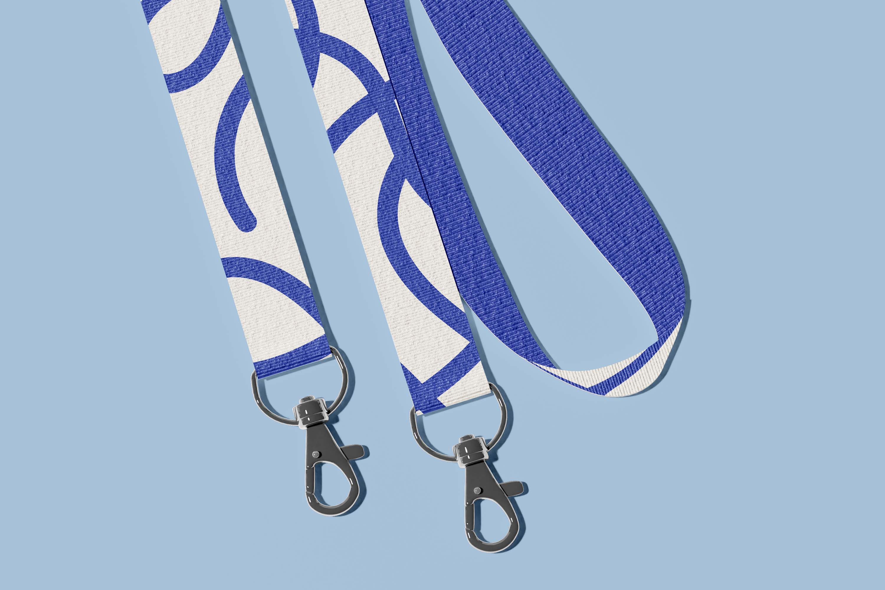
South East Helping Hands is a food bank in my hometown. I have volunteered there numerous times and noticed their logo could use some love. The old logo is outdated, the italicized type looks unprofessional and the icon is not unique. Before redesigning the logo, a deep dive into researching the industry and what they do was necessary to understand how to create the best brand toolkit. The final logo is a clean hand icon with a subtle “h” built into it – it feels friendly and professional. The logotype uses Nexa Heavy, and it pairs beautifully with the icon and adds to the welcoming vibe. I created a pattern of free-flowing lines by taking the linework for the logo, and this represents the life food provides us with. Keeping blue as the primary colour allows Helping Hands to stay recognizable.