Booster Juice Rebrand
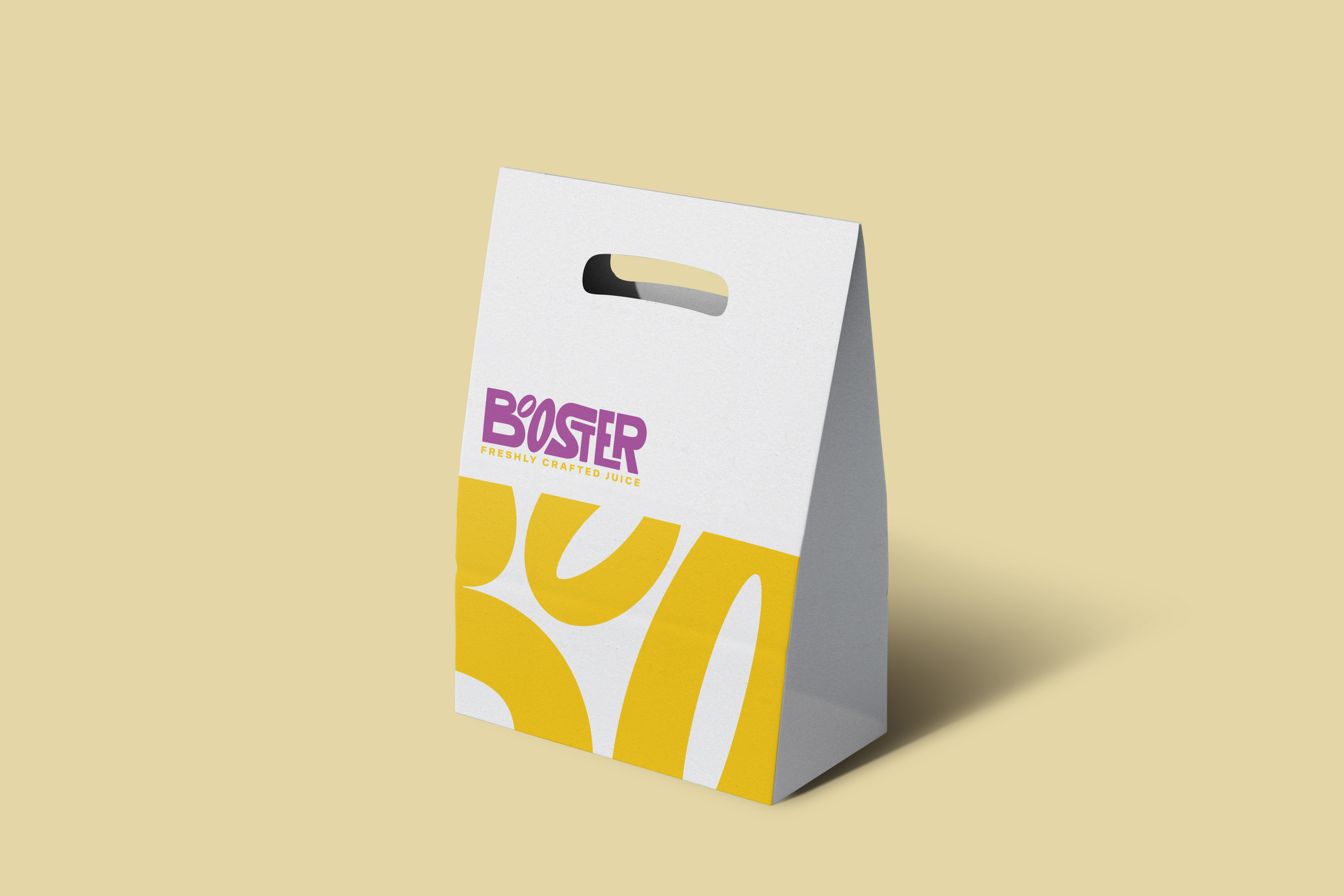
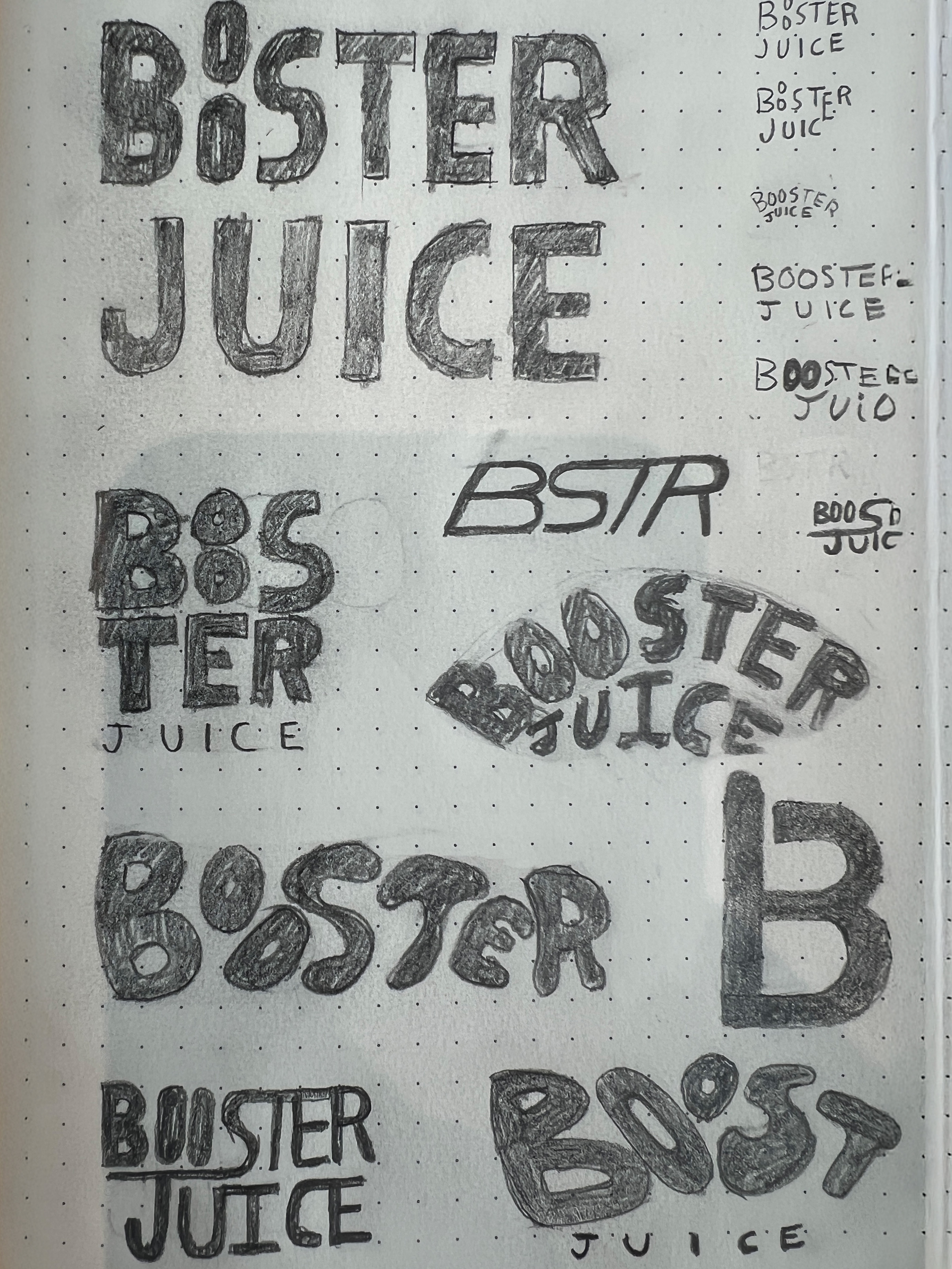
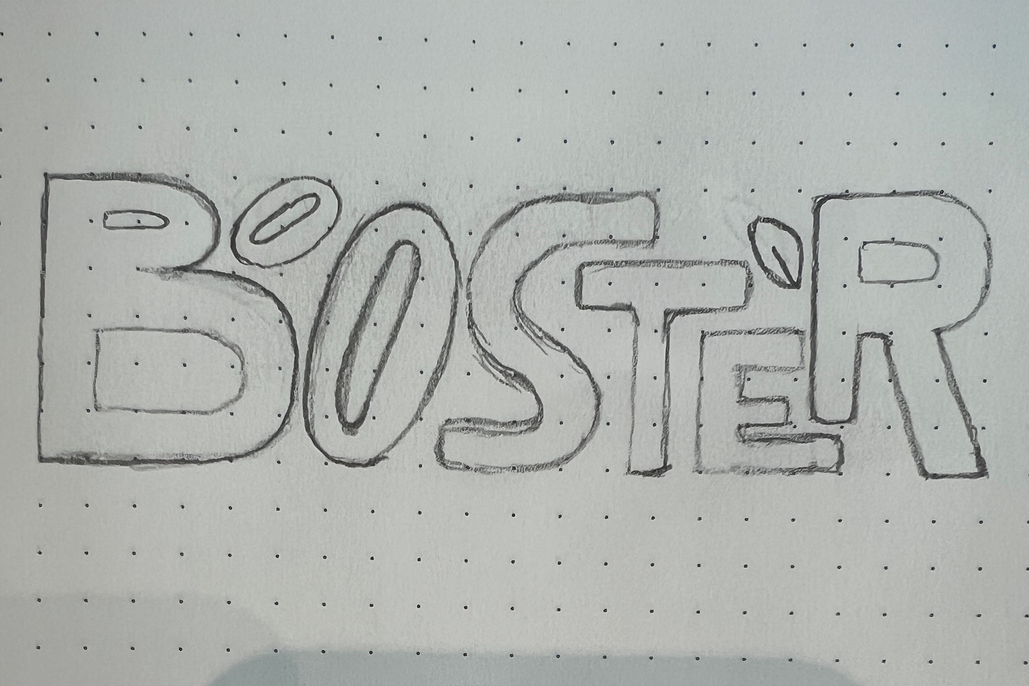
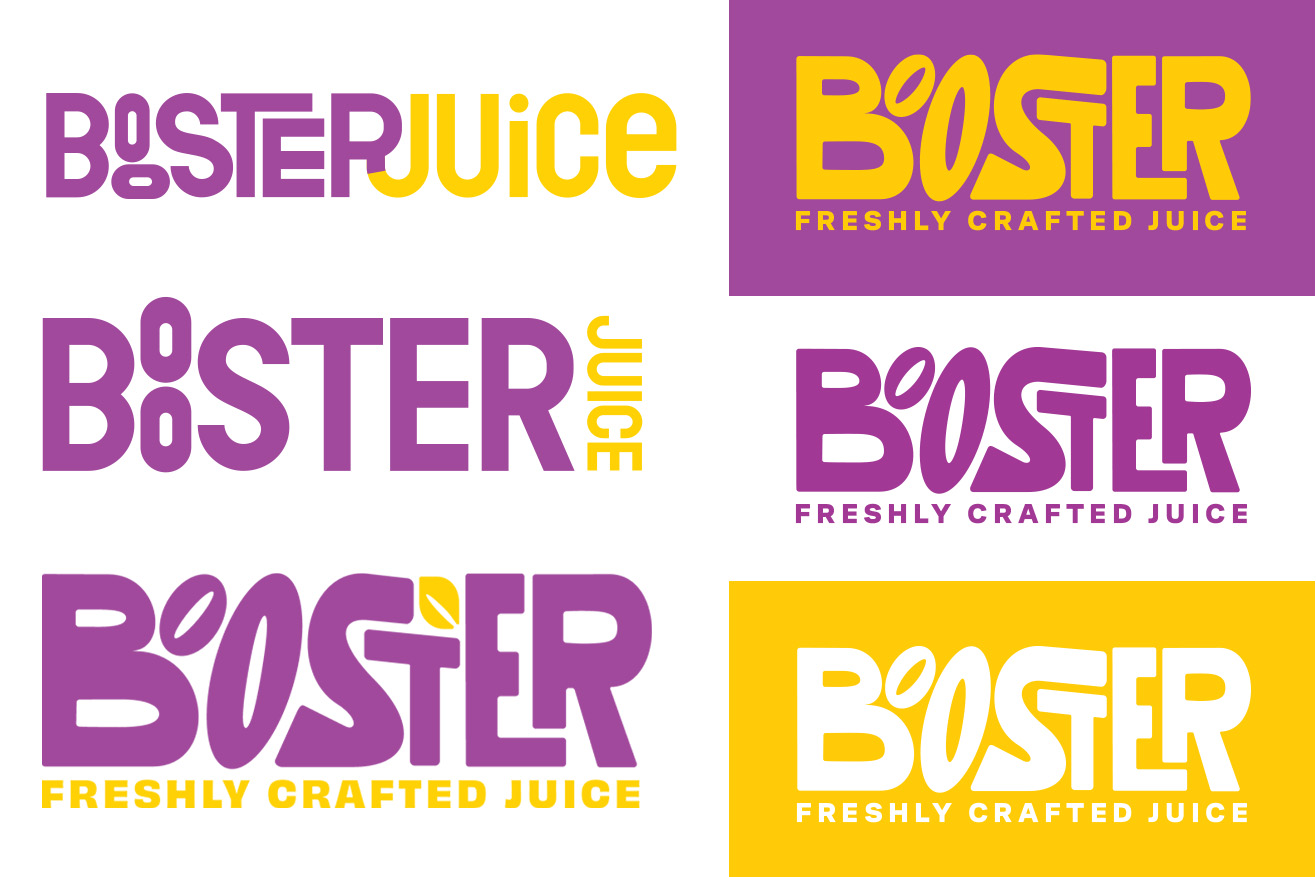
Booster Juice is long overdue for a redesign. Their logo has too many fine details that are hard to see when small, and it feels quite outdated. The goal was to keep the fun, unique look but make it current and a bit more professional to reach a broader audience. I created a custom wordmark that features rounded edges and funky counters. This logo solution is perfect for Booster Juice as it keeps the fun feeling but brings in a wordmark that will stand out in a market that lacks differentiation. This new logo also serves as a fun graphic element when enlarged and can be used as an image container. In the end, I tweaked their current brand colours to provide better legibility and contrast.